The name SaltBlack and the story behind our logo
Our name, SaltBlack, is a celebration and recognition of Naomi’s heritage and upbringing on SaltWater Country, as a Blak Woman.
Our Logo was designed by Larrakia artist Shaun Lee and commissioned by our Managing Director and Founder Naomi Anstess.
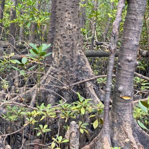
Our logo is a mangrove.
Naomi on the meaning behind the logo
“It reflects the story of how the mangroves are the greatest ecosystem in the world. It has all that beautiful life and vibrance going on in and around them – so much food, so many safe places to hide, so many species of animals. But they are so unassuming – kind of smelly, kind of dirty.
Behind them, the mangroves protect Country… People… Culture… Past… Value. They are immovable.
The mangroves look out to the horizon. This is like a metaphor for all of the technology and change of the future, rolling in, on the storm and the tide.
And what do they do? They don’t just let it all through. They still the storm. They stand strong with their value and presence, just like Aboriginal and Torres Strait Islander people. As we have done for generation, after generation. As we will continue to do.
SaltBlack is about that. It is about futures, integrity, connections and innovation. We will calm the storm, we will take the future in safely. We will help our people, protect our people and let them grow too, with the future in a calm and safe way.”
The mangrove in our logo also holds additional meaning for Naomi. Shaun Lee, the Larrakia artist and designer created the logo with four strong roots representing Naomi’s four daughters, Lilli, Pearl, Ruby and Rose, with her as the trunk. Together, they grow in resilience, rooted in the mud and earth, keeping each other grounded, ready for the future.
